Keeping it simple: The new Rayner website experience
Posted on 22/09/2017
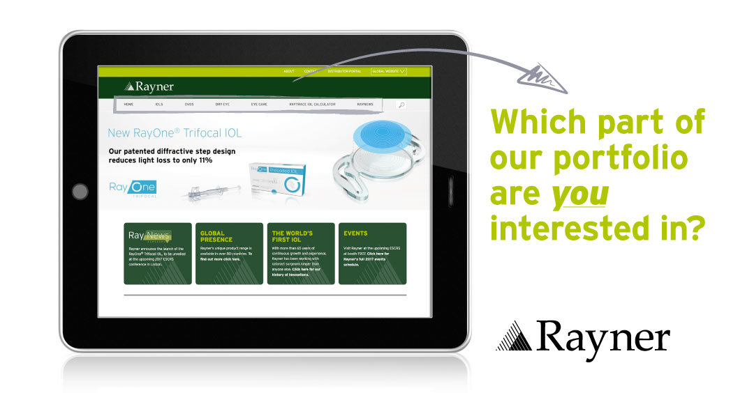
For those of you who have visited the Rayner website over the last few days, you will have noticed we’re now offering a very different online experience; one that we believe is clearer and more user-friendly.
It’s all about navigation
Here are some of the changes we’ve made:
- Full integration of our recently acquired dry eye and eyecare range meaning surgeons can now find the information they require all within the one website.
- Easier navigation: no more singular ‘product’ category showing the entire Rayner portfolio all within the one menu drop down. We’ve now segmented the navigation so it’s less overwhelming to find the product you are looking for.
- We’ve taken the previously singular ‘Rayner Clinical Resource Library’ page and split it accordingly across each of the IOL and OVDpages. This means that you can now find all available scientific papers and supporting materials for your product of interest within one click.
- It’s clear that product pages are the most frequently visited area of the website. That’s why we’ve taken all of the non-product related content and placed this all within the ‘about’ page, prioritising the visibility of what surgeons are truly looking for.
We’ve kept our dedicated US website, our RayNews newsroom is still featured prominently on the homepage, and as the company continues to expand its network of distributors as well as direct markets, we decided to make access to our Global Presence pagefeature prominently on the homepage, too.
In addition to refreshing our website, Rayner continues to have an active presence on social media, all with the aim of giving surgeons an enjoyable and enhanced online experience.
